How Color Sets Emotion & Expectation
Colors trigger emotional shortcuts. Blues often signal trust and reliability; oranges communicate energy and creativity; greens lean into growth and wellness. The right palette shapes how customers feel about your brand before they read a single word.
- Trust & Stability: Navy, deep blues, cool neutrals.
- Energy & Innovation: Orange accents, warm gradients.
- Calm & Care: Soothing greens, soft palettes.
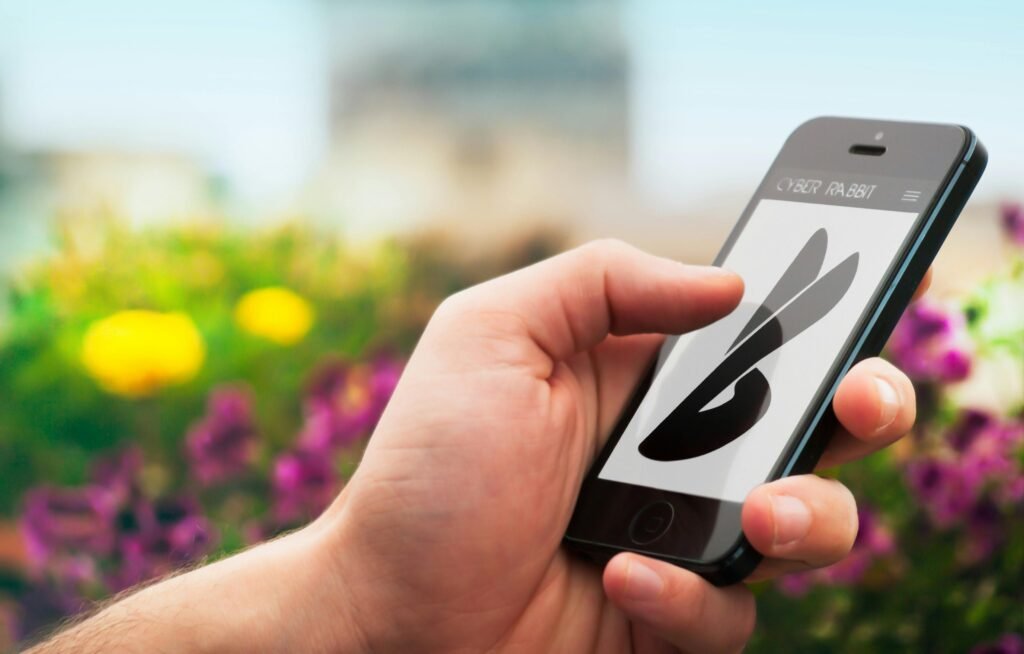
Why Shapes Whisper Meaning
Shapes carry built-in symbolism. Circles feel friendly and inclusive; squares and rectangles suggest order and reliability; triangles imply motion, focus, or ambition. Combining shapes with the right color amplifies your logo’s message.
Tip: Avoid random symbolism. Choose shapes that reinforce your brand values and audience expectations.
Typefaces Signal Personality
Serif fonts often convey tradition and expertise; sans-serifs feel modern and clean; bold geometric fonts read as confident and tech-forward. Spacing and letter shapes affect readability and tone.
Consistency across logo, website, and social builds recognition. When your typography aligns with your color and shape choices, you create an identity people trust.
“Your logo is a split-second story — color, shape, and type must tell the same truth.”
Simplicity Makes You Memorable
Great logos are simple enough to recognize at a glance and flexible enough to scale. Remove visual noise so your core idea stands out — that’s what makes it stick in customers’ minds.
- Limit colors and avoid thin, fussy lines.
- Test recognition at small sizes and in monochrome.
Design for Real-World Use
A strong logo works on a billboard, a phone screen, embroidered on a shirt, or as a favicon. Build a system: primary logo, horizontal lockup, icon mark, light/dark versions.
Pro move: Package deliverables with clear usage guidelines to keep your brand consistent everywhere.
Design the Feeling — Not Just the Mark
Logos that win aren’t accidental. They’re built on psychology: color for emotion, shape for meaning, and typography for personality — unified by simplicity and versatility.
When your logo expresses who you are at a glance, customers recognize you faster and trust you longer.
Need a Logo That Customers Trust?
We craft logos and mini brand systems that look great everywhere — web, social, print — and align with your growth goals.